First of all, what are Responsive Websites?
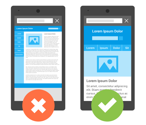
Responsive Websites are mobile-friendly websites that can automatically change their layouts/design to fit different screens. The purpose of responsive websites are to provide the best user experience for site visitors.
Why Make a Website Mobile-friendly?
 #1 Reason:
Mobile-friendly Websites Provide Better Experience for Mobile Users
Traditionally, websites are designed for viewing on desktop mainly. However, as you know, mobile is changing the world. Today, everyone has smartphones with them, constantly communicating and looking for information. In many countries, the number of smartphones has surpassed the number of personal computers; having a mobile-friendly website has become a critical part of having an online presence.
The desktop version of a site might be difficult to view and use on a mobile device. The version that’s not mobile-friendly requires the user to pinch or zoom in order to read the content. Users find this a frustrating experience and are likely to abandon the site.
In the USA, 94% of people with smartphones search for local information on their phones. Interestingly, 77% of mobile searches occur at home or at work, places where desktop computers are likely to be present.
Mobile is critical to your business and will continue to be so – whether you’re blogging about your favorite sports team, working on the website for your community theater, or selling products to potential clients. Make sure visitors can have a good experience on your site when they’re visiting from their mobile devices!
#2 Reason:
Google Announced that Mobile-friendly Websites will Boost the Rankings of their Webpages
In February, Google announced that the mobile-friendly update will boost the rankings of mobile-friendly pages — pages that are legible and usable on mobile devices — in mobile search results worldwide. (Conversely, pages designed for only large screens may see a significant decrease in rankings in mobile search results.)
Starting April 21, Google will be expanding the use of mobile-friendliness as a ranking signal. This change will affect mobile searches in all languages worldwide and will have a significant impact in our search results. Consequently, users will find it easier to get relevant, high quality search results that are optimized for their devices.
If you haven’t made your website mobile-friendly, you should. Majority of the users coming to your site are likely to be using a mobile device.
Need Help with your Website?
Contact SmallBiz Web Design today to upgrade your website to a Responsive Website!